Beam 2.0® XR Application
Enhancing Grocery Shopping Accessibility: A Virtual Reality Solution for Remote Customers.
Role
XR Designer and Research
Industry
Retail and Consumer Goods
Duration
6 months (2024)
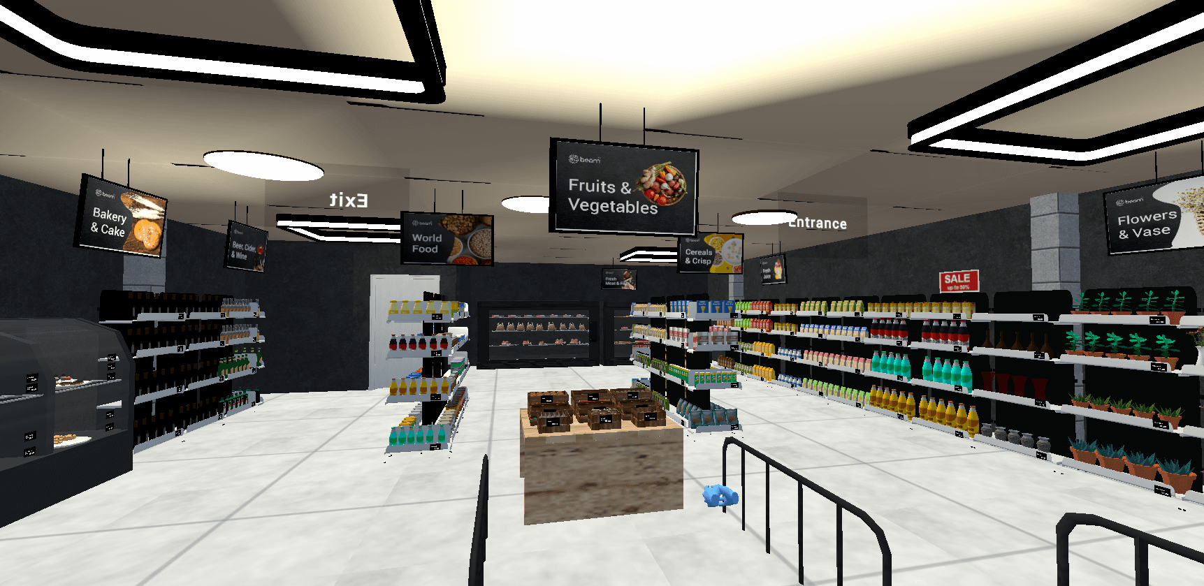
Overview of Beam 2.0 VR App
The Beam 2.0 VR app is an innovative solution designed to revolutionise the grocery shopping experience for remote users by leveraging Virtual Reality (VR) technology. This application addresses key accessibility challenges faced by individuals living in remote areas who struggle with reaching physical stores due to geographical and time constraints. By integrating VR into grocery shopping, Beam 2.0 aims to test for the level of presence that would provide an immersive and interactive alternative to traditional and online shopping methods, bridging the gap between convenience and engagement.
Problem Statement
Traditional grocery shopping is highly dependent on physical store visits, where customers can interact with products, compare prices, and receive immediate assistance. However, individuals residing in remote or underserved areas face significant challenges in accessing these stores, leading them to rely on online shopping. While online grocery platforms offer convenience, they often lack the interactive and sensory engagement found in physical stores, diminishing the overall shopping experience. This disconnect creates a gap in accessibility and satisfaction for remote shoppers.
The Beam 2.0 VR app seeks to address this issue by creating a simulated shopping environment that mirrors in-store experiences. By enhancing presence and immersion, the app aims to provide a more engaging, accessible, and inclusive shopping alternative for individuals who cannot easily visit physical grocery stores.
Research & Problem Definition
The design process began with field research across multiple UK grocery stores (Tesco, ALDI, CO-OP, Sainsbury’s). The aim was to understand how customers interact with space, products, and design cues.
Key Observations:
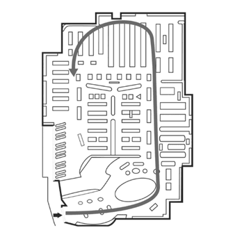
Customers often moved in a counterclockwise direction (Image: Claus and Marion, 2015)
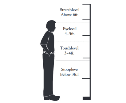
Eye-level shelves drew the most attention (Image: Claus and Marion, 2015)
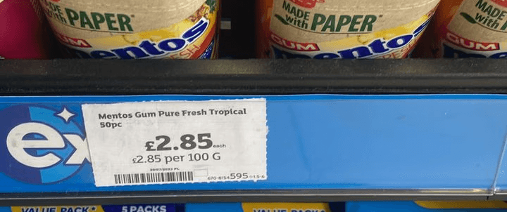
Customers perceive the use of nine-ending pricing (e.g. £2.99) in retailing as cheaper.
Warm lighting, background music, and intuitive layouts positively influenced mood
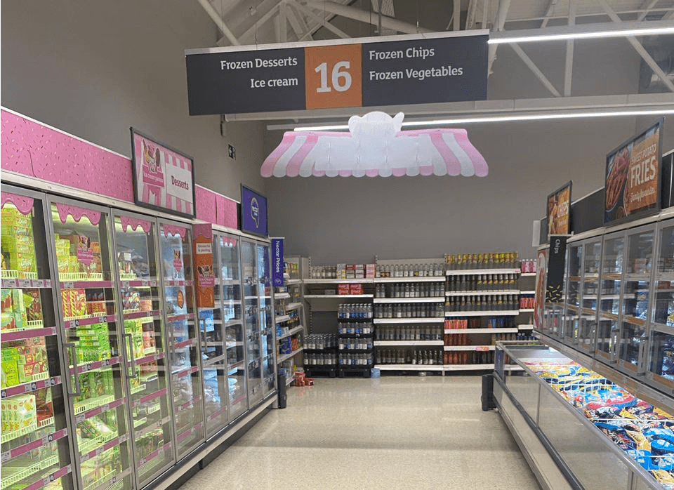
This data formed the backbone of the VR experience, grounding the design in real, observable behaviours.
User Demographics
Beam 2.0 VR is designed to serve a diverse user base, particularly focusing on:
Remote and Rural Residents: Individuals who face geographical barriers preventing them from accessing physical grocery stores.
Elderly Users: Those with mobility challenges who require an alternative shopping method that is both convenient and interactive.
Busy Professionals and Parents: Users who seek an efficient, immersive shopping experience that saves time without sacrificing engagement.
Tech-Savvy Consumers: Early adopters of VR technology are interested in exploring innovative shopping solutions.
Key Features and Objectives
Beam 2.0 VR app recreates a fully simulated grocery store environment, allowing users to navigate virtual aisles, inspect products, and interact with store elements as they would in a physical store. Unlike standard e-commerce platforms, which lack sensory engagement, this VR experience enhances the sense of presence and immersion, replicating the tactile and visual elements of in-store shopping. Users can explore shelves, compare items in real-time, and purchase items.
The app has been developed with the following objectives:
Enhance Accessibility: Provide an alternative grocery shopping experience for individuals who cannot easily access physical stores.
Improve Presence and Immersion: Simulate an in-store experience that incorporates realistic product interactions.
Increase Customer Engagement: Offer a user-friendly and dynamic environment that fosters active participation.
Validate VR's Retail Potential: Conduct empirical research on the effectiveness of VR in improving customer satisfaction and convenience.
Design Process
We adopted the six-phase design thinking approach because of its user-centric nature that leads to the innovation of a product and a hands-on problem-solving approach. It follows an iterative manner, which was one of the key rationales for its adoption in this research.
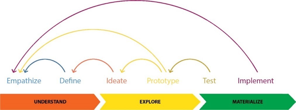
The six iterative design thinking phases
1. Empathise
This phase involved studying the traditional in-store grocery design to support the development of a realistic VR simulation. Multiple site visits were conducted to CO-OP (Clydebank), Sainsbury’s (East Kilbride), Tesco (Glasgow City Centre), and ALDI (Clydebank). Observations focused on customer navigation, layout, stimulus response, and emotional cues like lighting and music. Secondary research supported findings, confirming industry practices like placing high-margin items at eye level (Chen et al., 2021) and designing engaging entry zones (Underhill, 2000). These insights became the foundation for the virtual store narrative.
2. Design
Using a VR Story ARC and VR Storyboard, research insights were converted into a structured VR experience. The narrative aimed to direct users through the store naturally, enhancing presence and participation (Fitz-Patrick, 2023). The storyboard helped align design intent with user emotion, facilitating ideation and reinforcing empathy-driven UX decisions (Soegaard, 2024).
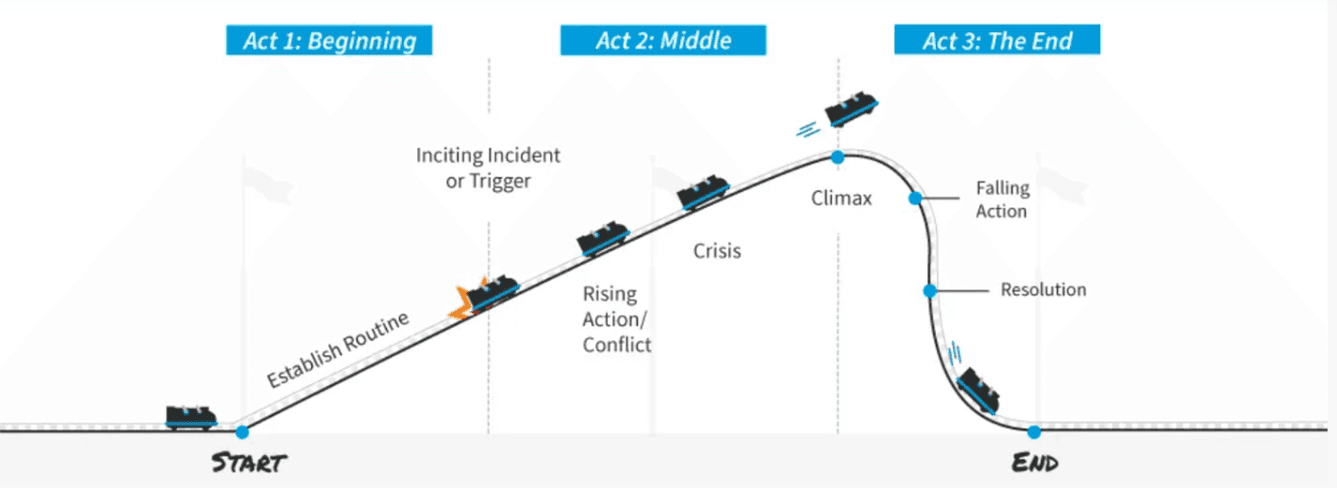
VR Story ARC
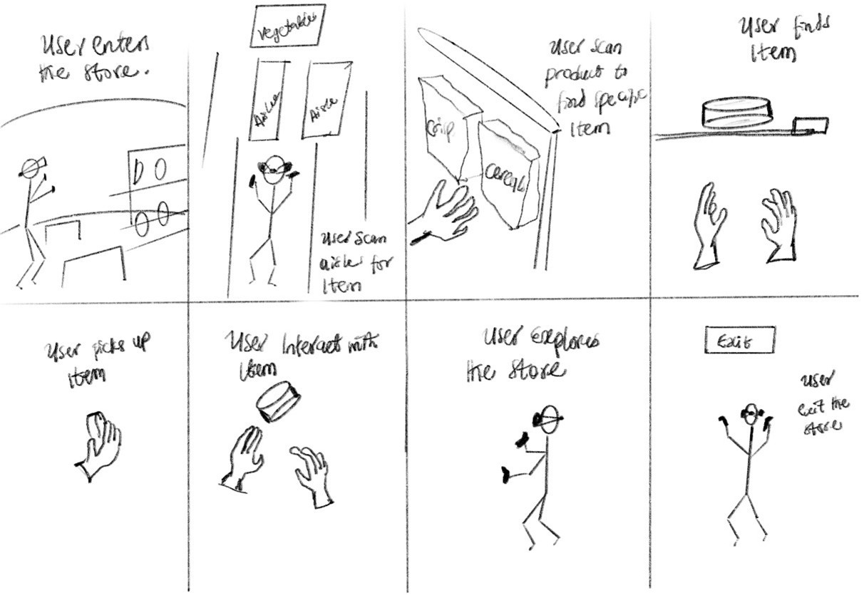
The VR Storyboard for the simulated grocery store
3. Ideate
Multiple store layouts were sketched based on free-form design principles (Claus and Marion, 2015). Four layout blueprints were considered, each varying in aisle arrangement and checkout location. Layout (d) was selected for its alignment with real-world store dynamics and research findings.
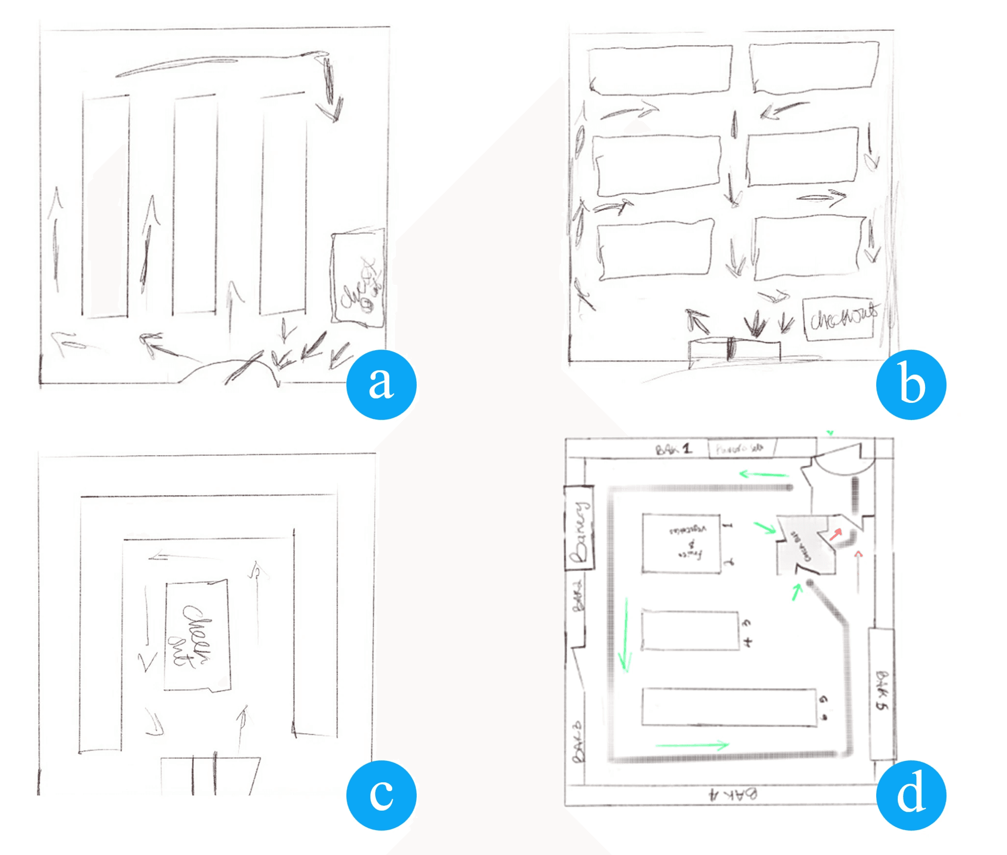
The four brainstormed free-form layouts
4. Prototype
Development began using Unity and Blender. An initial prototype was scrapped due to low realism and a mismatch with UK store expectations. A second version was constructed using custom-built elements from Blender and imported assets.
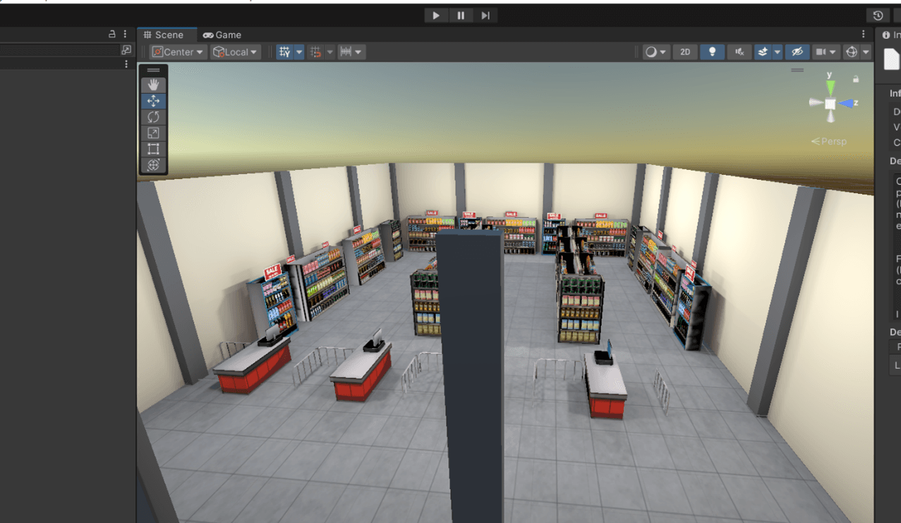
The initial VR grocery store design before testing
The modified VR grocery store design after testing
Challenges Experienced
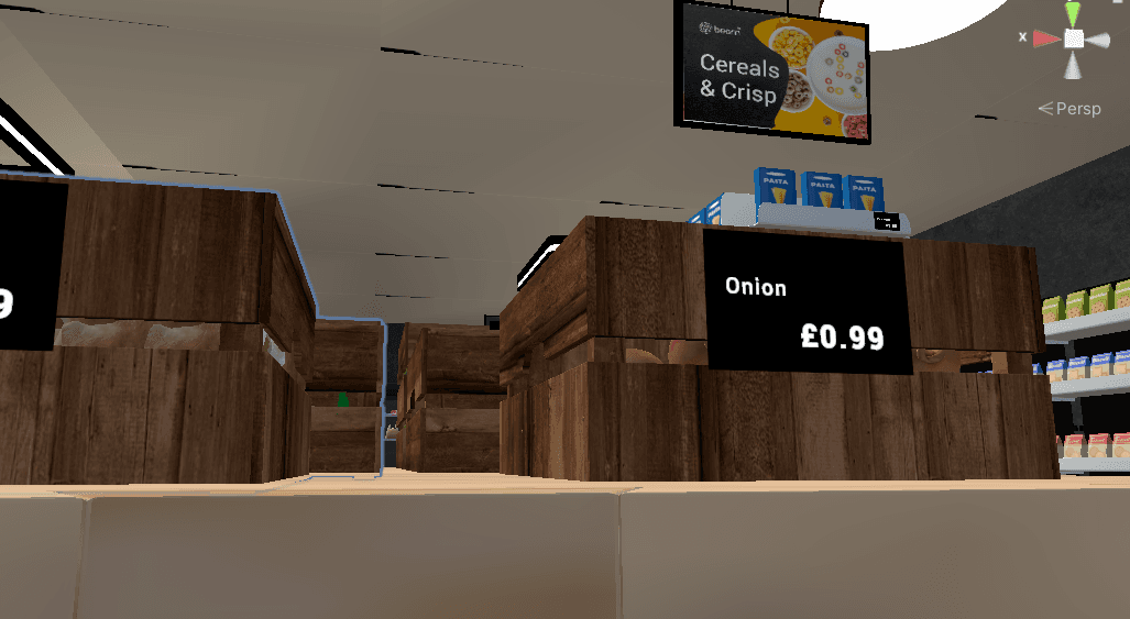
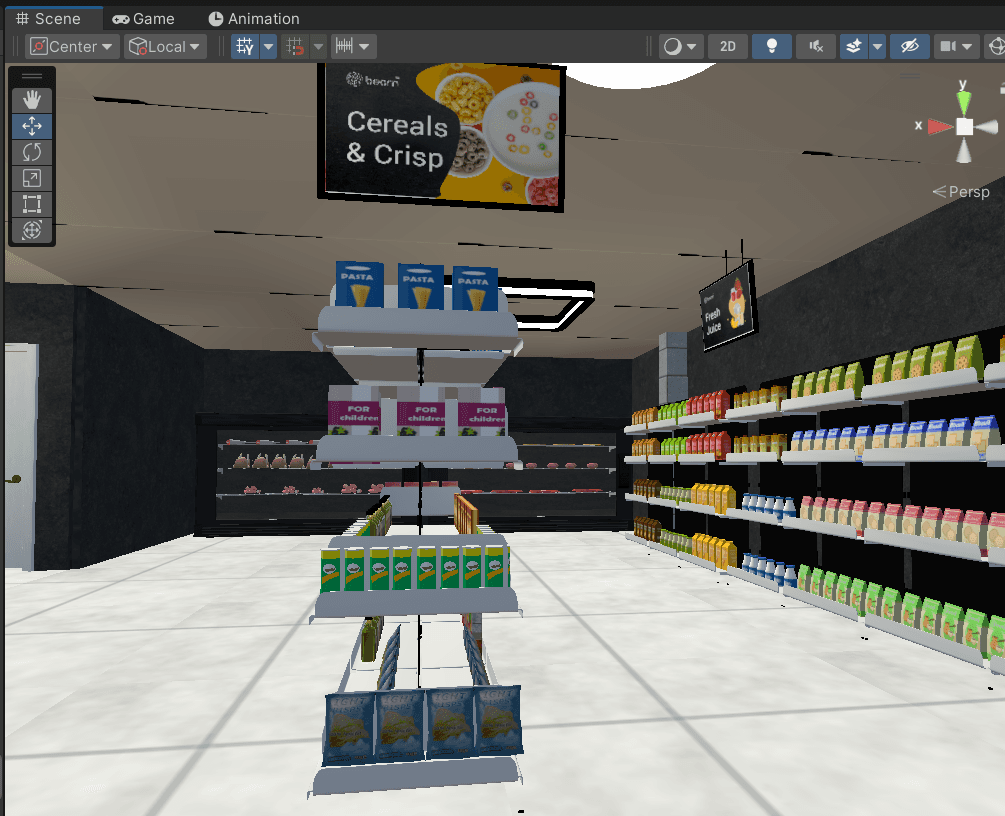
Challenges included incorrect shader pipelines, resolved by implementing the Universal Render Pipeline. Shelves were custom-modelled and aligned to traditional shelf zoning: stretch, stoop, touch, and eye levels. A cognitive map and signage system aided in spatial orientation.
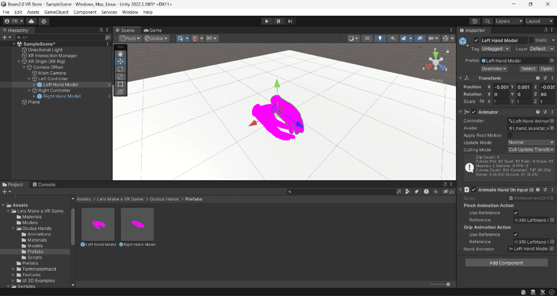
Image depicting the initial challenge where the mesh object was rendered using an incorrect pipeline
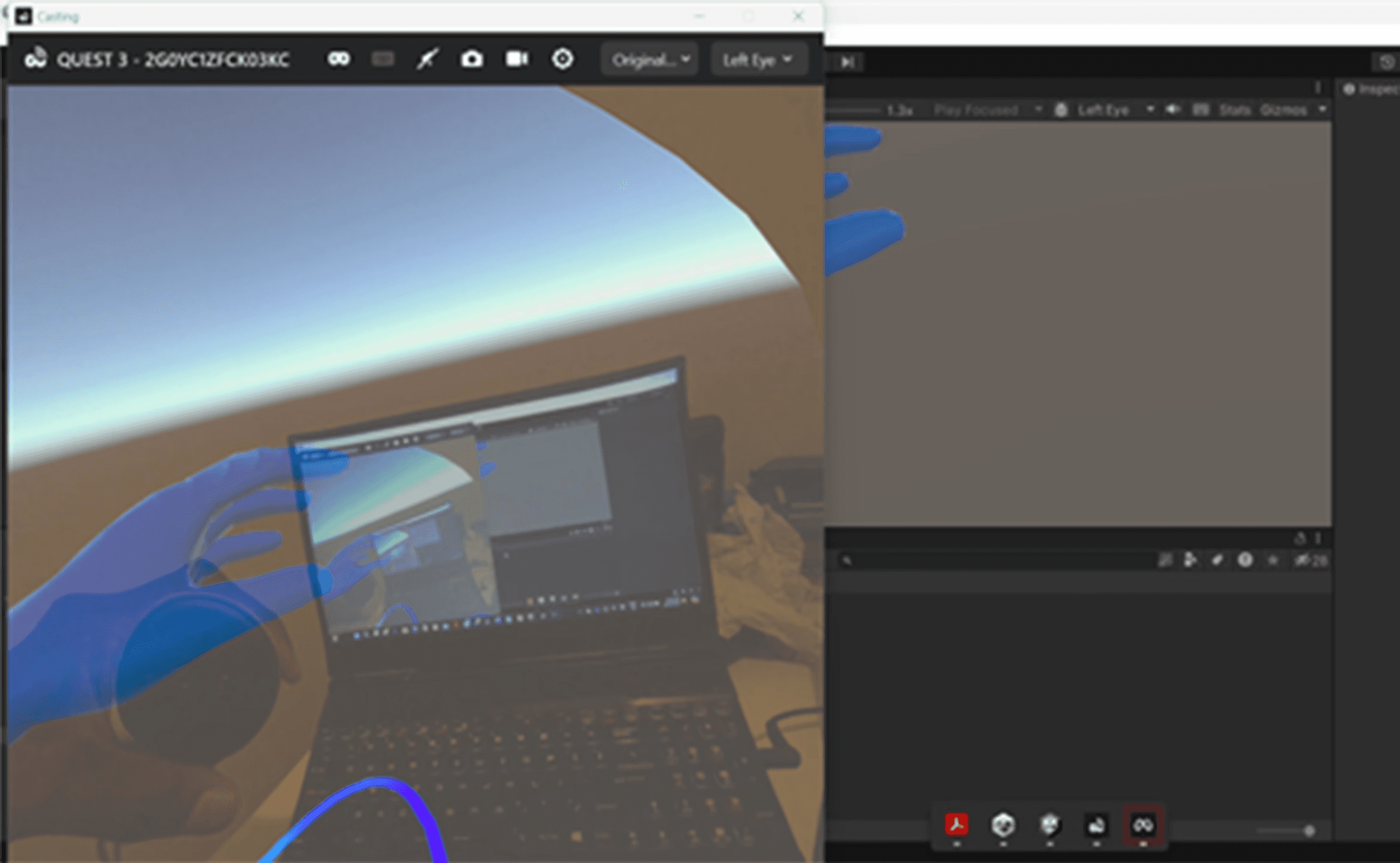
Image showing the mesh object after being updated with the Universal Render Pipeline
5. User Testing, Iterations, and Evaluation
This study employed a mixed-method approach to evaluate the presence and usability of the VR grocery store. The combination of quantitative, qualitative, and physiological data ensured a comprehensive understanding of user experience, presence, and interaction.
Participants
Eighteen participants (Master's and PhD students from Glasgow Caledonian University) aged 18–35 were recruited. Eight took part in the final study. Participants were evenly split by gender and had varying levels of VR experience. Criteria included English proficiency, recent in-store grocery shopping experience, and comfort with technology.
Study Design
Originally planned as a between-subjects experiment, the study shifted to a within-subjects design due to the small sample size and logistical constraints. All participants were expected to have prior physical store shopping experience before testing the VR store. This design allowed for a more consistent comparative analysis.
Materials
The following materials were used:
Information Sheet & Consent Form: Ensured ethical compliance and informed participation.
Task Sheets: Standardised user tasks for consistent measurement.
Pre-survey: Collected baseline data on tech comfort and shopping habits.
Observation: Monitored real-time user behaviour, task completion, and physiological cues (heart rate, stress).
Post-survey: Focused on presence, satisfaction, and likelihood of reuse using Witmer and Singer’s 32-question format.
Semi-structured Interviews: Gathered rich qualitative insights, mitigating biases in survey-only designs.
Apparatus
Meta Quest 3 & Oculus Controllers: For immersive interaction
Unity Engine: Development platform
Meta Link & Developer Hub: Device synchronisation
E45 Wristband: Captured physiological data
Microsoft Forms: Survey collection
Digital Recorder: For post-interviews
Usability Test Procedure
Eight participants (4 male, 4 female) took part in the usability test on 10th July 2024 at Glasgow Caledonian University. Half had prior VR experience, mainly in gaming. The 2.5-hour session was held in Room C107a to allow free navigation, and physiological data was recorded using the E45 wristband.
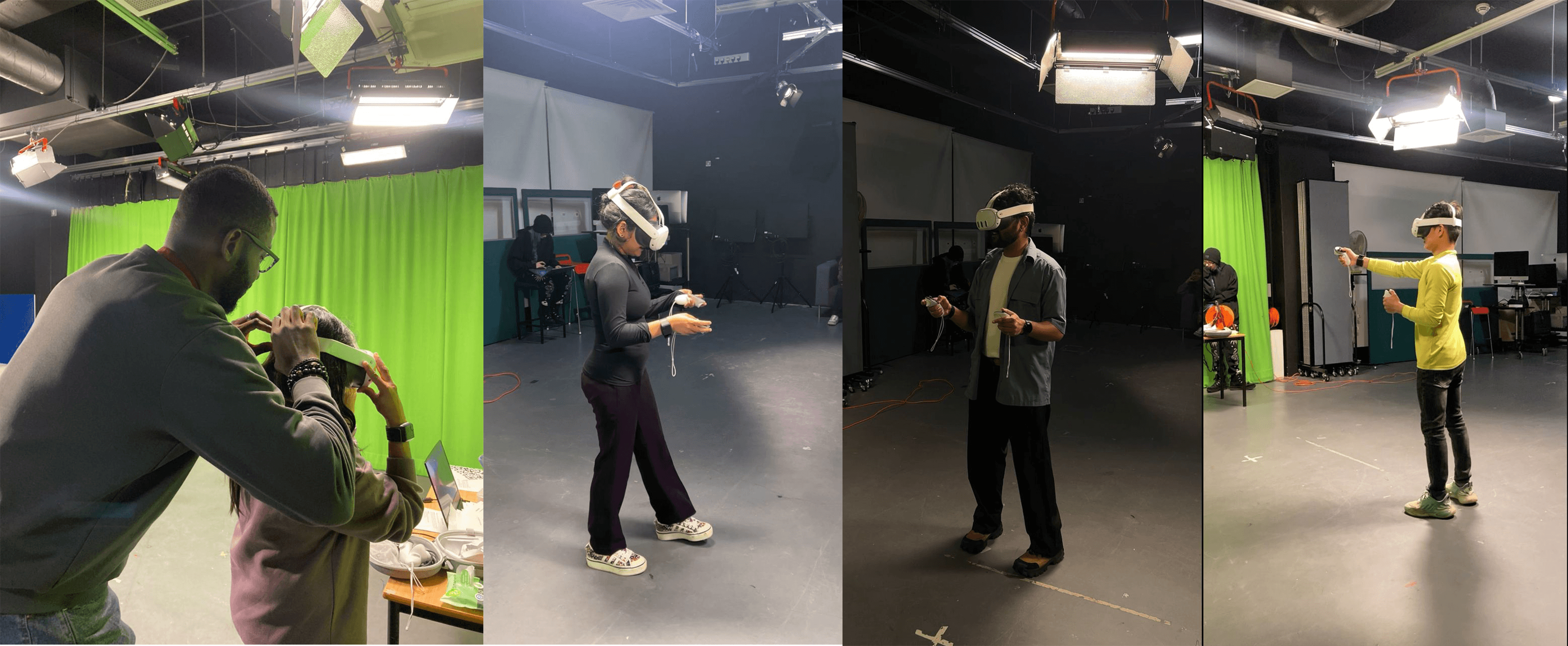
Some participants during the usability test
Participants:
Signed consent forms
Completed pre-surveys
Received VR system training
Navigated the VR store to locate a “Tuna” item
Had physiological responses recorded (e.g., heart rate)
Completed post-surveys and interviews
Usability Task: “Find the Tuna”
Participants were instructed to
Enter through the designated entrance
Locate and collect the tuna item
Exit via the correct path
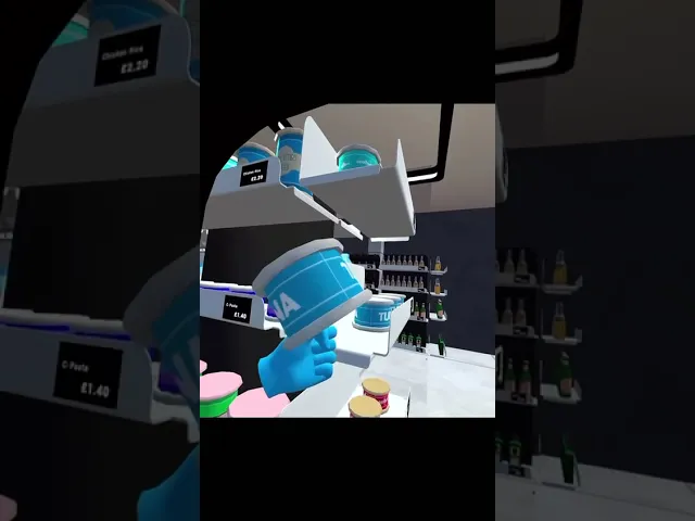
A participant with the Tuna Item during the task
Success Criteria:
Proper navigation through entrance and exit
Tuna item found
Low frustration levels
Task completed promptly
A participant undergoing usability test
Results Overview
Survey Analysis:
63% found navigating their physical store easy
50% said the VR store felt realistic; 50% noted differences affecting immersion
Descriptive Stats (VR Store):
Navigation: 3.75/5 (SD = 0.89)
Satisfaction: 4.5/5 (SD = 0.76)
Likelihood to shop again: 4.0/5 (SD = 0.53)
Recommendation likelihood: 8.75/10 (SD = 1.16)
Qualitative Analysis
The post-interview sessions revealed several important insights that supported the quantitative findings and offered deeper context around user experience and presence within the VR grocery store.
Realism and Presence
Many participants expressed excitement about the authenticity of the store layout. One participant commented,
“I was very excited as soon as I saw the store layout and everything, I mean, I’m in a physical store. I’ve never been to this store before.”
This emotional response reinforces the sense of presence the design aimed to evoke. Another user, drawing on her habitual shopping behaviour, described how she relied on intuition to navigate the store:
“When I started the journey, I was following intuition… these are all bottles, not on this side… like how we usually do in a supermarket.”
This reflects naturalistic decision-making aligned with real-world shopping habits and suggests the environment successfully mirrored the cognitive flow of traditional stores.
Spatial Awareness and Layout
Participants also appreciated the thoughtful spatial arrangement. One participant observed,
“I think the spacing in the store follows the same standards as I expect to see in a physical store. Like, you have enough space for someone else to pass.”
Another respondent echoed this feeling of realism:
“I felt like I was entering one of the Tesco stores to buy something.”
These observations affirm the effectiveness of our layout design in reinforcing user comfort and believability, both key components of immersion.
Atmosphere and Convenience
The environmental cues, such as lighting, also played a role in enhancing the experience. A participant noted,
“The hyper-clean light overhead makes it feel like you are in a real store, I could lose track of time.”
This aligns with Coelho et al. (2012) and Underhill’s concept of the “transition zone,” where sensory and emotional shifts signal the entry into a shopping experience. The realistic design of the VR store successfully triggered these transitions, further validating the research hypotheses.
Physiological Analyses
Participants showed varied engagement in the VR grocery store. Most (A–G) reported high presence (4–5), especially with prior VR experience. Task times ranged from 2:46 to 8:26 minutes, with longer durations linked to navigation challenges. Frustration levels varied (3–5), often tied to entrance/exit confusion and product visibility. Physiological data generally aligned with presence scores, confirming immersion. Participant H's data was excluded due to technical issues.
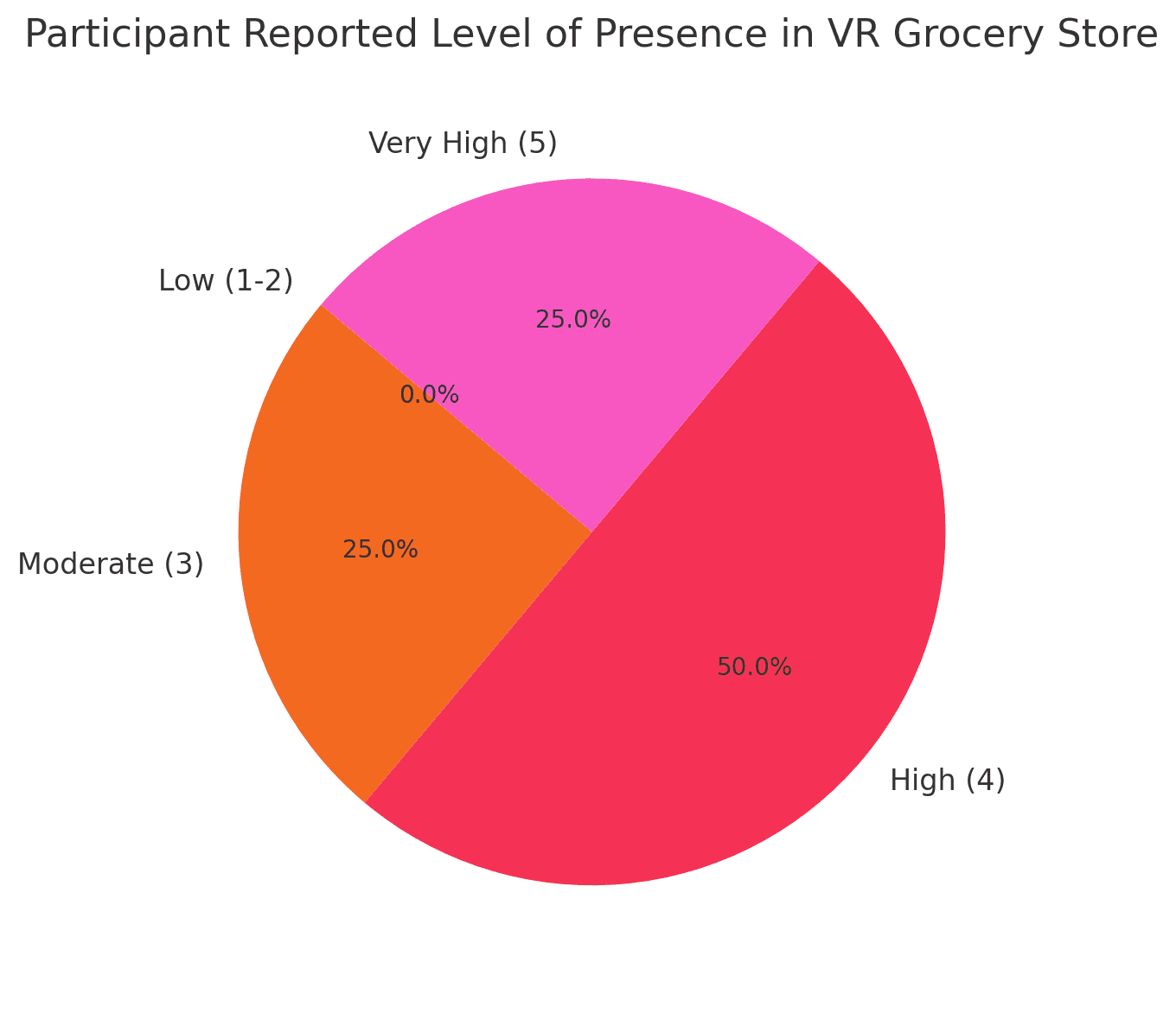
Correlation:
A strong correlation (r ≈ 0.74) was found between ease of navigation in physical vs. VR environments, validating the hypothesis that VR can replicate physical store presence.
Ethical Considerations
Approved by the SCEBE ethics board, the study followed GDPR compliance and participant well-being measures. Participants could withdraw at any point and were debriefed post-study.
Accessibility Considerations
Accessibility was a central focus of the project, with several elements deliberately designed to cater to users with varying abilities:
Clear, wide aisles to allow for smoother virtual movement
Large signage with icons and text for users with visual impairments or dyslexia
High contrast between shelves and products
Simplified interaction model (hover-to-select or gaze interaction)
Future integration of voice control and audio navigation cues
These choices were guided by inclusive design principles and participant feedback during early usability tests.
Usability Testing Metrics:
Attribute | Avg. Rating (1–7) |
|---|---|
Feeling of Presence | 6.5 |
Navigation Ease | 6.2 |
Visual Realism | 6.4 |
Comfort (No Sickness) | 6.1 |
Product Recognition | 6.3 |
Key Quotes:
“It reminded me of walking into my local CO-OP.”
“I instinctively knew where to go.”
“Honestly, I forgot it wasn’t a real store for a moment.”
Technical Outcomes:
Reduced motion sickness by 30%
Frame rate improved significantly after mesh optimisation
Spatial memory was clearly formed; users didn’t need directional cues after one lap

Other projects
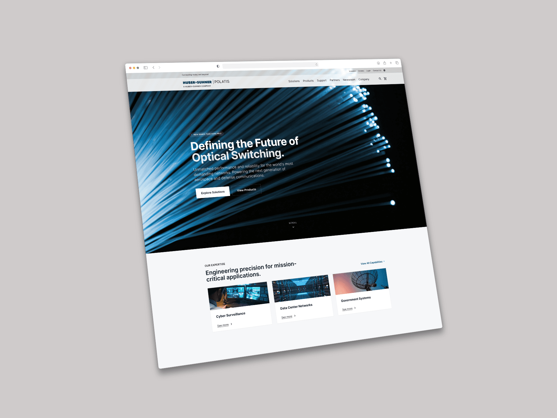
Polatis Huber +Suhner
Website Modification
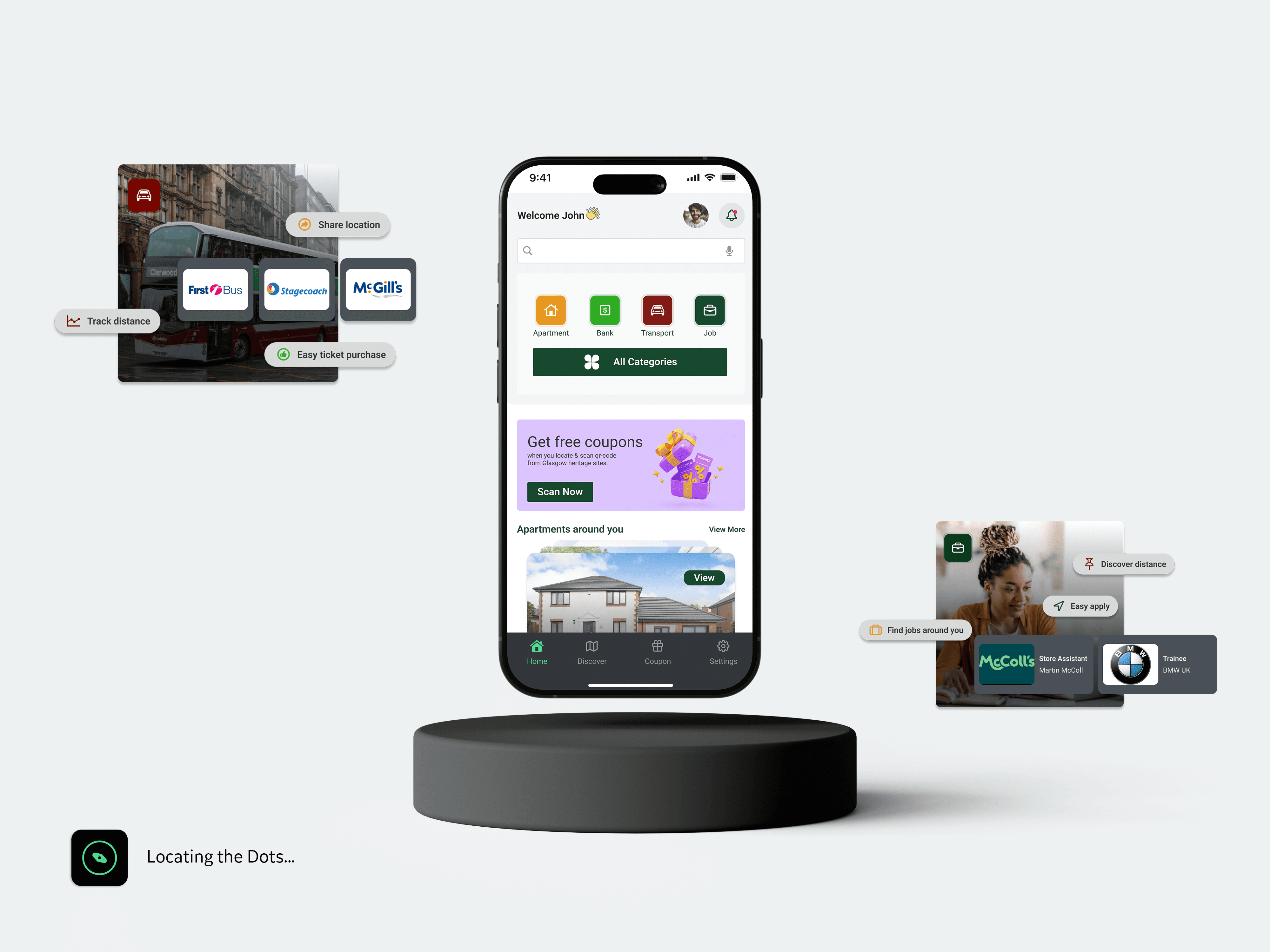
GlasXplore®
GlasXplore helps university students navigate city life by providing essential services like housing, jobs, and transport. It enhances their experience through personalisation and interactive features.
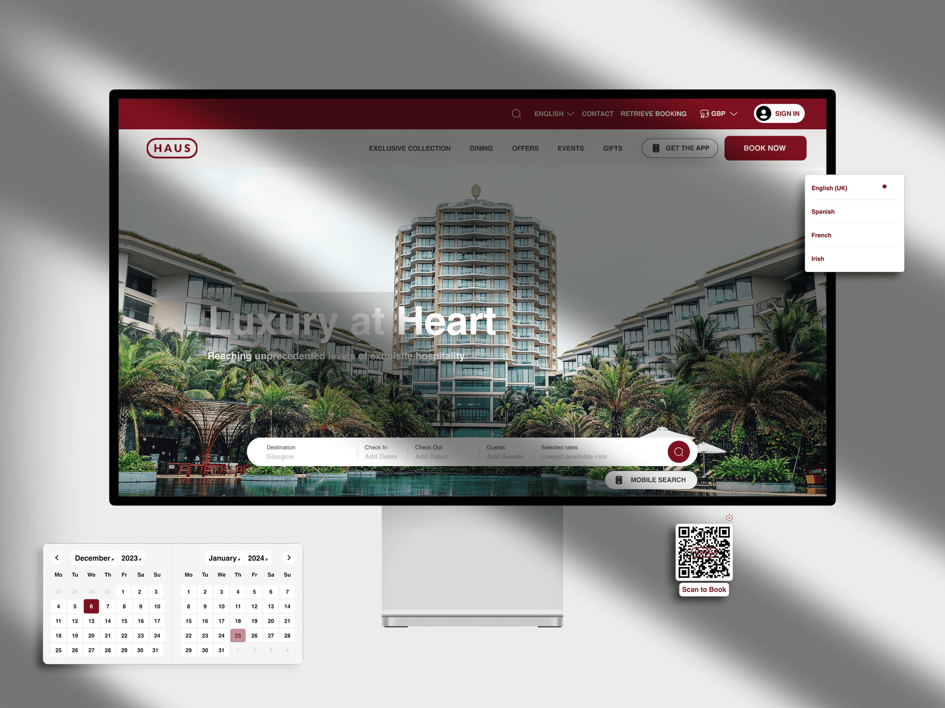
HAUS Hotel®
Designing a website for luxury, business-class digital experience for that connects professional guests through seamless, refined, and accessible design.